Helping Solar Panel Operators Spot Issues Faster

Helping Solar Panel Operators Spot Issues Faster

Helping Solar Panel Operators Spot Issues Faster

Product Design · 2020

Role

Research, Product design,
Design system

Time‍

05. 2020 - 10. 2020

Team‍

1 Product Manager
2 Designers

Project Type

Web Admin Dashboard

Tools‍

Sketch, Zeplin

Overview

Overview

Soul Energy is a renewable energy company that recently rebranded its product system and user experience.
One of its products, OCTO Admin, helps power plant owners manage their facilities more effectively by overseeing operations and maintenance.

Soul Energy is a renewable energy company that recently rebranded its product system and user experience.
One of its products, OCTO Admin, helps power plant owners manage their facilities more effectively by overseeing operations and maintenance.

Accomplishments

Accomplishments

  1. Resolved a complex issue regarding the outdated design

  2. Solved the UI problems for the admin

  3. Simplified all data and graphs

  4. Implemented a new design system to keep brand and UX consistency

Products of Soul Energy

Products of Soul Energy

Soul Energy offers three distinct products. I was responsible for the
mobile/web and control system, as well as overseeing the administration dashboard.
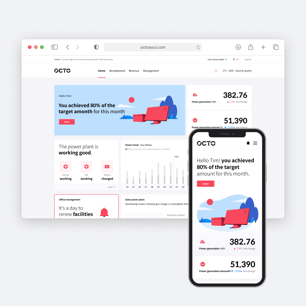
PowerPlants Monitoring system

PowerPlants monitoring system

PowerPlants Monitoring system

Web/Mobile App

Control system

Control system

Screen Kiosk

Manage Powerplants

Manage Powerplants

Admin Dashboard

The Problem

The Problem

The dashboard consisted mostly of complex charts and outdated design, making it difficult for solar panel operators to communicate the issues that needed fixing.

The dashboard consisted mostly of complex charts and outdated design, making it difficult for solar panel operators to communicate the issues that needed fixing.

Researching the UX problems in the product

Researching the UX problems in the product

After conducting thorough research and reviewing feedback, I have identified several major issues with the current system:

1. The charts on the main dashboard are unclear and do not account for various data cases, resulting in UI errors.
2. The side panel displays unnecessary information about who is logged in.
3. The development and alert pages are difficult to navigate due to complex charts that require endless scrolling.
4. Clicking on the solar station triggers multiple popups, making the process more complicated.
5. The side menu's icons and colors are not intuitive for each name.

Ideate of IA and layout

Ideate of IA and layout

Based on the user voice that I got from the client, I wanted to define what information we should show in the dashboard.

Creating wireframes

Creating wireframes

When creating the wireframes, I took into consideration the placement of the information.

Creating annotations to consider different data cases

Creating annotations to consider different data cases

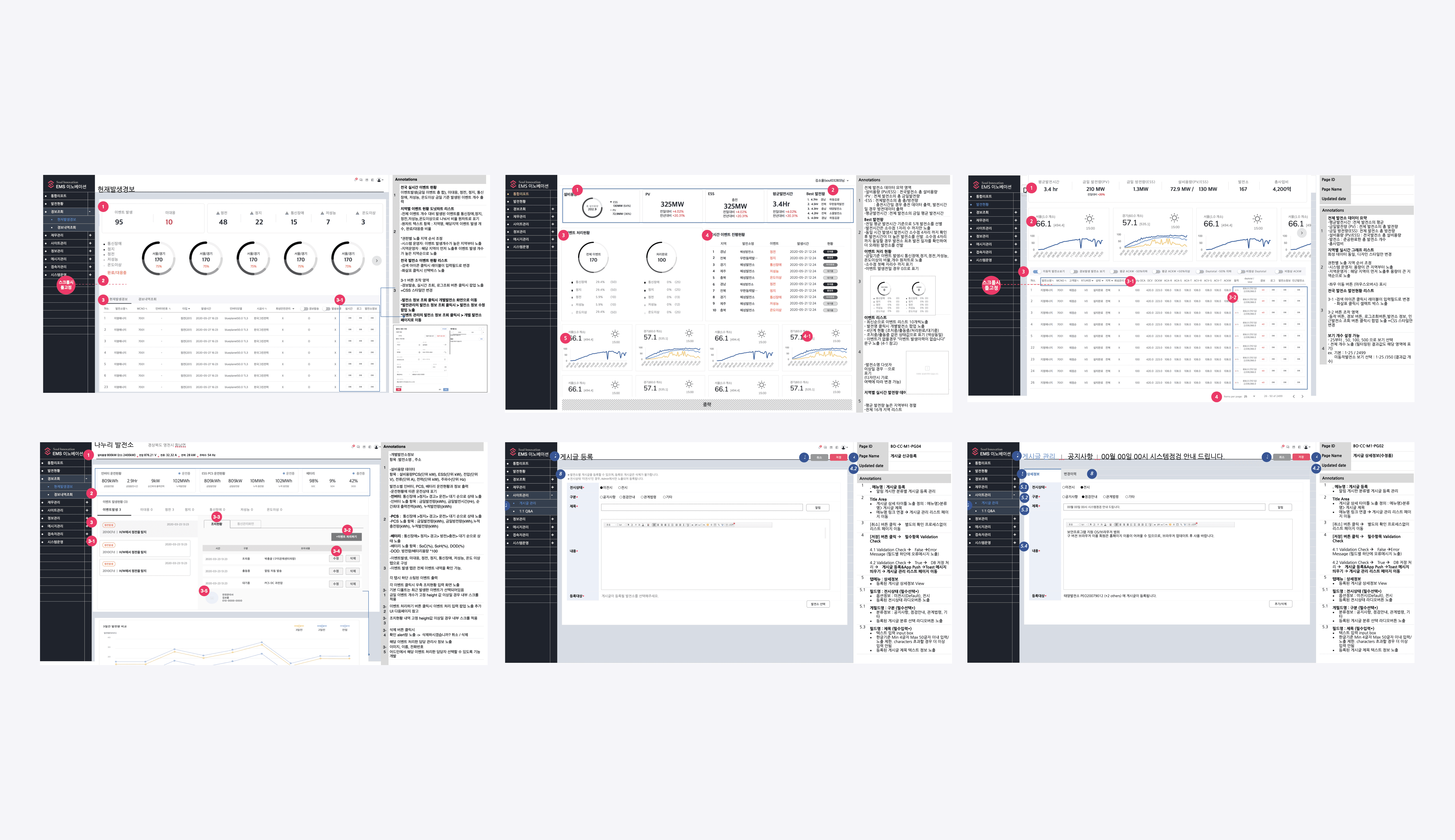
As part of my design process, I added annotations to the wireframes for the engineers. I carefully considered various data points such as maximum and minimum numbers, maximum and minimum text, and the number of different cases that needed to be considered. This helped me plan the layout before moving on to the design stage and ensured that both internal and external teams were in alignment.
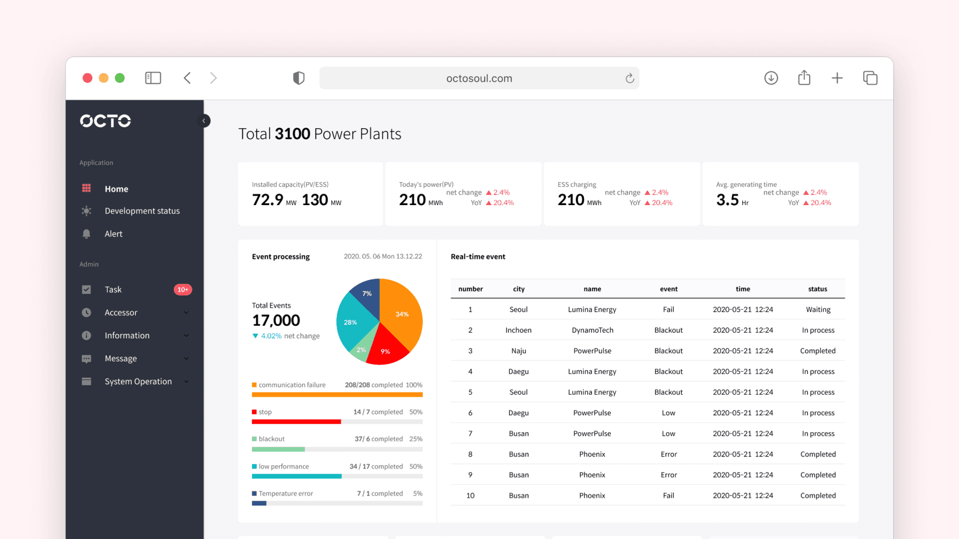
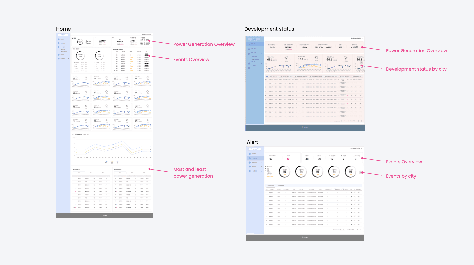
Final Design

Final Design

< Main Page >
1. Users can easily see the generation overview and problems with solar panels.
2. Considered different data cases and fix the layout errors.
3. Removed unnecessary information such as users’ login information.
4. Produced various types of chats to display information intuitively.
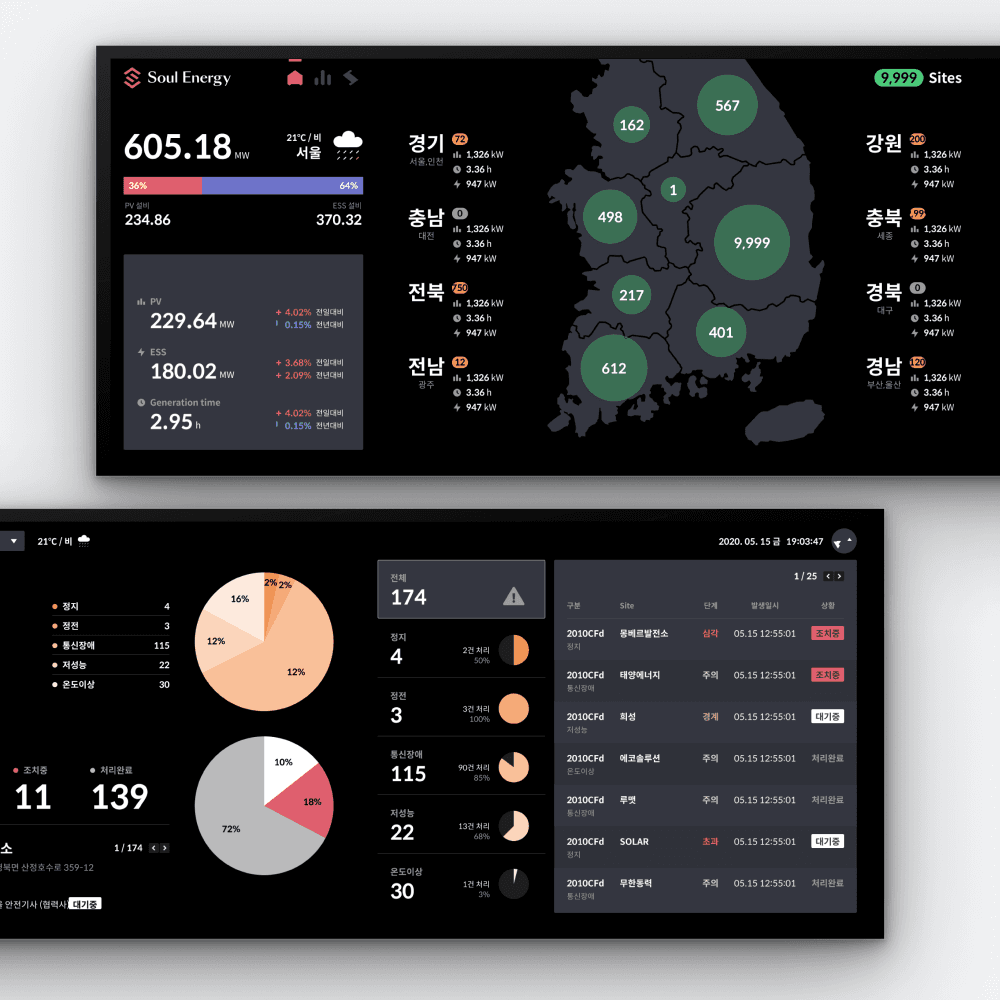
< Generation Status >
1. Provided the overview of generation status and overview generation by cities
2. Provided page table chart to solve the problem of unlimited scrolling
3. Combine the same functions on the chart filter to minimize the data

< Alert >
1. Provided the overview of issues of power plant stations by cities and problems.
2. Provided page table chart to solve the problem of unlimited scrolling.

< Power plant station detail >
1. Provided the detail of current operation status and events for each power plant

Short-Term solution

Short-Term solution

Pop-ups
For the short-term solution, I kept the existing layout but applied a new button and a Typography design system for pop-ups.

Pop-ups
For the short-term solution, I kept the existing layout but applied a new button and a Typography design system for pop-ups.

Pop-ups
For the short-term solution, I kept the existing layout but applied a new button and a Typography design system for pop-ups.

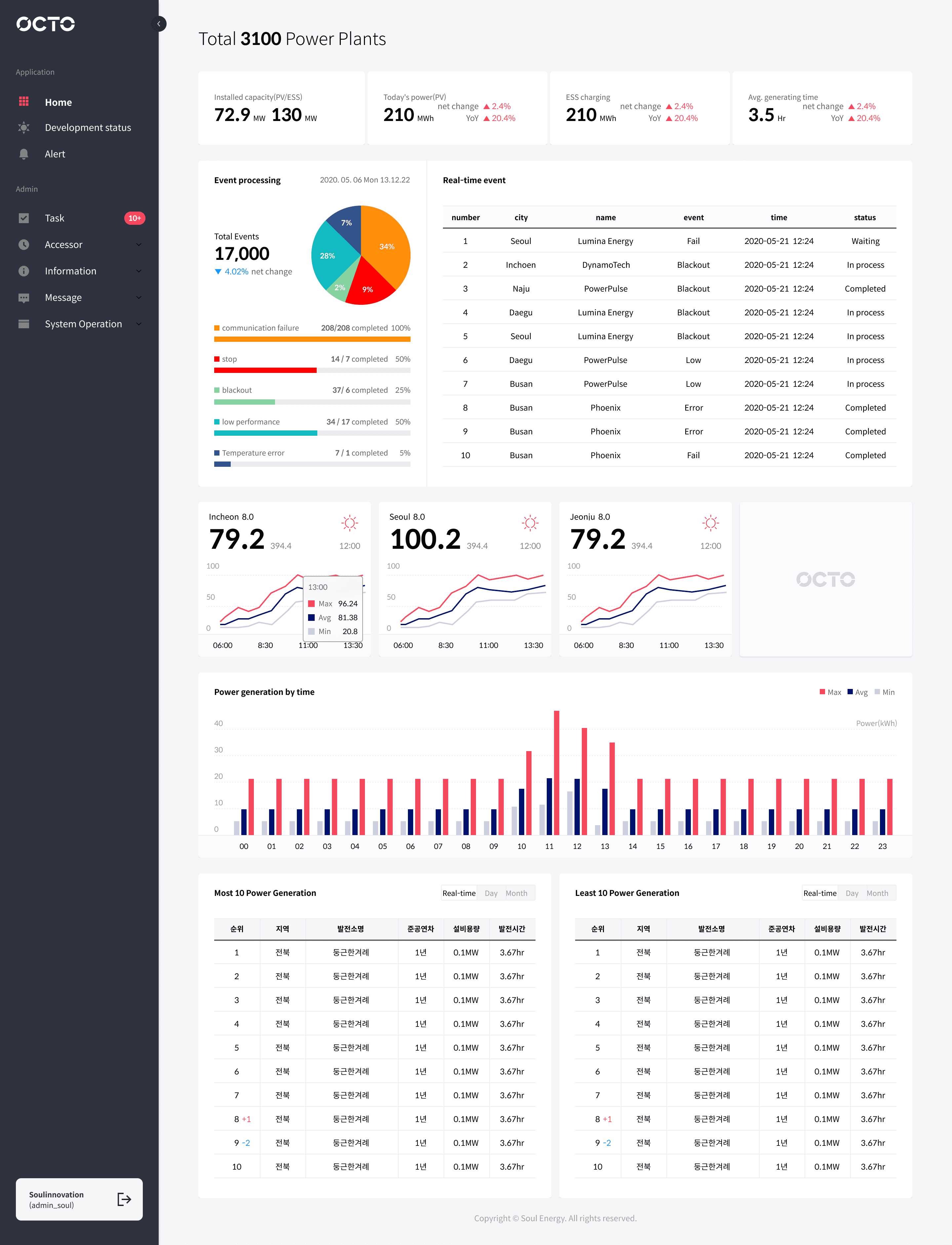
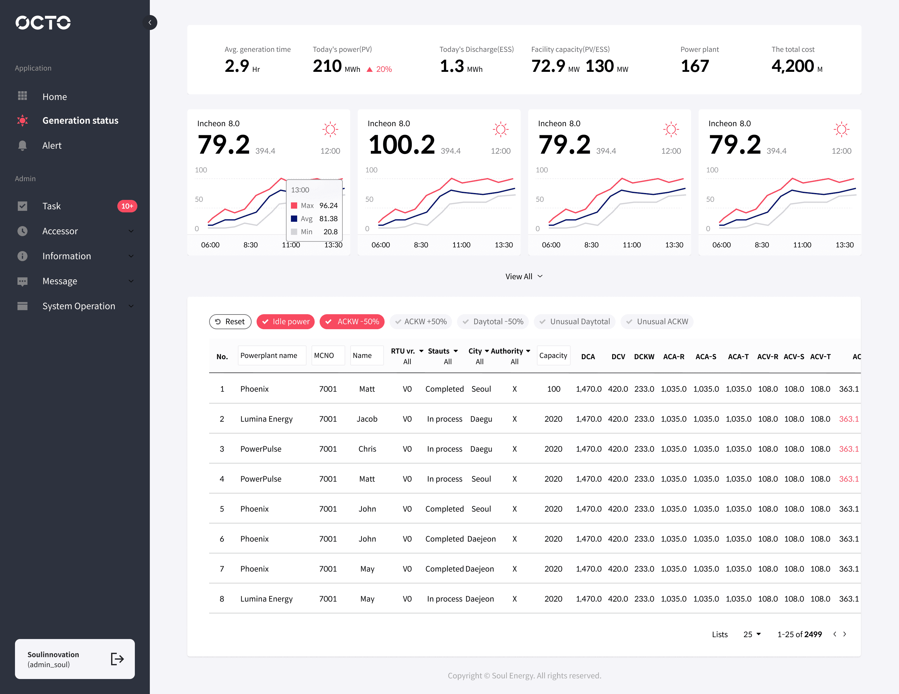
Final Design Prototype

Design guideline

Design guideline

I created a design system based on other Soul Energy products to maintain design consistency. I organized the side menu, button states, hierarchy, and graphs, including explanations for each system's rules.

Take Away

Take Away

  • Implementing the design system
    As we were working on this project, Solar Panel was going through a rebranding phase and updating their design system for both new and old products. This experience taught me how important it is to maintain consistent branding and design for both the users and businesses. I am proud to have been part of the team that created a design system that is still being used in our products today.

  • Importance of curiosity in design
    To come up with great designs, I took the time to really understand how the solar panel system works. I asked the client lots of questions to make sure I was on the right track with my design ideas. It was actually pretty fun learning all about it, and I even discovered some new possibilities along the way.

Other Projects

Other Projects

Texture

Fint

CPA Ontario