User Research · 2023
Role
Time
04. 2023 -06. 2023
Team
2 Designers
Project Type
Tools
Recruiting users and moderating user testing sessions on time
Measured the success rate of user tasks and flows
Produced solution report for UX improvements

The test was conducted online with 10 participants in 5 different segments for 1 hour. Both desktop and mobile versions of 2 websites were tested.

Before creating questions, I analyzed the website and found a few points that may be difficult for users to locate.
1. Organization of content
2. Information about renewing their subscription
3. Information on the course cards
1. The Explore dropdown menu
2. Finding a course on desktop and mobile
3. Button name and use of filter
4. Arrow buttons navigation on the mobile
Scenario 1
You're considering signing up for the subscription plans for CPA Ontario and you're exploring subscription options and information about the courses.
Task:
How would you explore the subscription information on the homepage?
Scenario 2
You’re a member who is purchasing professional development products.
Task: How would you explore the courses and events available for you on the homepage?
Scenario 3
You have now chosen a specific course/event.
Task: Please go through the task of purchasing this course

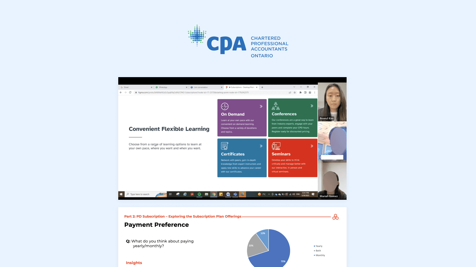
After conducting tests, I discovered that 60% of users want to know about exceptions and the location of seminar information before signing up for the subscription.
80% of users thought the price was reasonable. And 50% of users did not notice the information regarding renewing subscriptions. Additionally, 70% of users did not utilize the drop-down menu to search for courses.

40% of users had difficulty finding a specific course due to it not being listed on the drop-down menu. Also, users had trouble clicking on course cards that were not clickable.
During the checkout process, 50% of users encountered issues such as adding items to the cart twice and difficulty adding a new address.

Remove unvalued contents on the main page
Provide Information about renewing the subscription plan and what is exceptional in the subscription.
Improve the button name of ‘Enrol now’ to ‘learn more and make the card clickable
If a user had a product in the cart, after logging in make sure it lands on the checkout page.
Create questions with a purpose
I've come to the realization that some of the questions I asked during user testing weren't particularly informative. This was probably because I didn't have a clear understanding of what I hoped to gain from those questions. After that, I made sure to build questions thinking about what I want to gain from the questions.Don't make assumptions about users
I learnt to not make assumptions about users because it's often you will see the users interact in different ways or have different opinions about designs.